Kroshka Kartoshka (literally “Little Potato“) is the first
Russian chain of fast-food restaurants. For 25 years, the
chain has been developing its unique format: baked potatoes
with fillings, created as an alternative to classic fast food.
Today, there are more than two hundred cafés throughout the
country, but there is no single style in the design, and you can
still find different versions of the logo, various color palettes,
patterns, and slogans. The main task was to update and unify the
identity and attract a young audience while maintaining brand recognition.
The symbol of Kroshka Kartoshka since the beginning has been a chef wearing
a jacket and cap. The character was refined, maintaining a balance
between detail and readability. The chef's pose was improved in
terms of anatomy, and the minimalistic suit gave him a more modern
and professional appearance.
In today’s era of artificial perfection, a true “Russian hygge“ was
created: the updated design refers to cozy, warm memories
from childhood and the Scandinavian idea of finding happiness
in everyday little things. This is reflected in the updated
color palette and photography style. Graphics such as text
patterns, marker underlining, illustrations, and textures
created from scanned prints of real potatoes also help
create a soulful and crafty design.
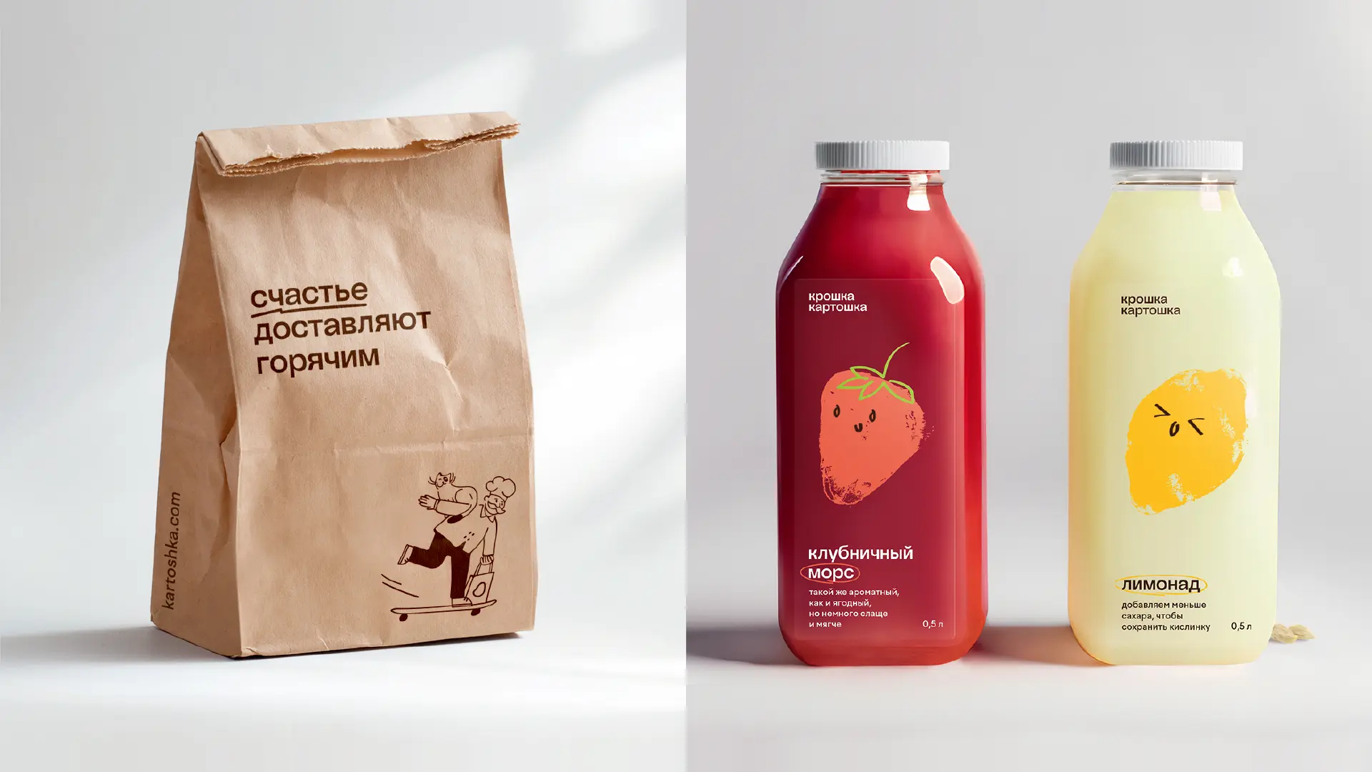
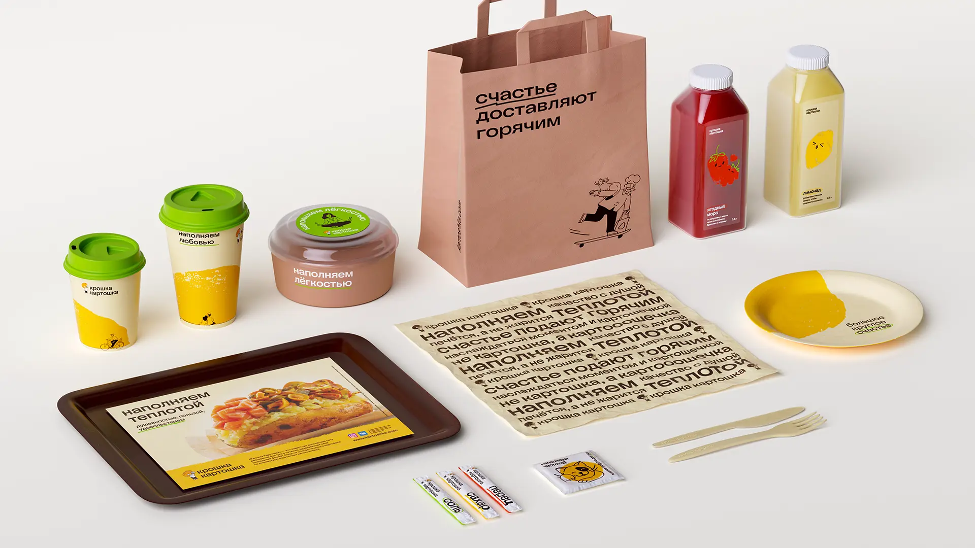
Modern handicraft has become the main idea for the packaging
line. Uneven potato textures serve as a background for
characters (for example, in the form of a potato “sun“)
and become part of the illustrations on the labels. The
text pattern made of copylines is used on the wrapping
paper, adding a touch of soulfulness with tags.
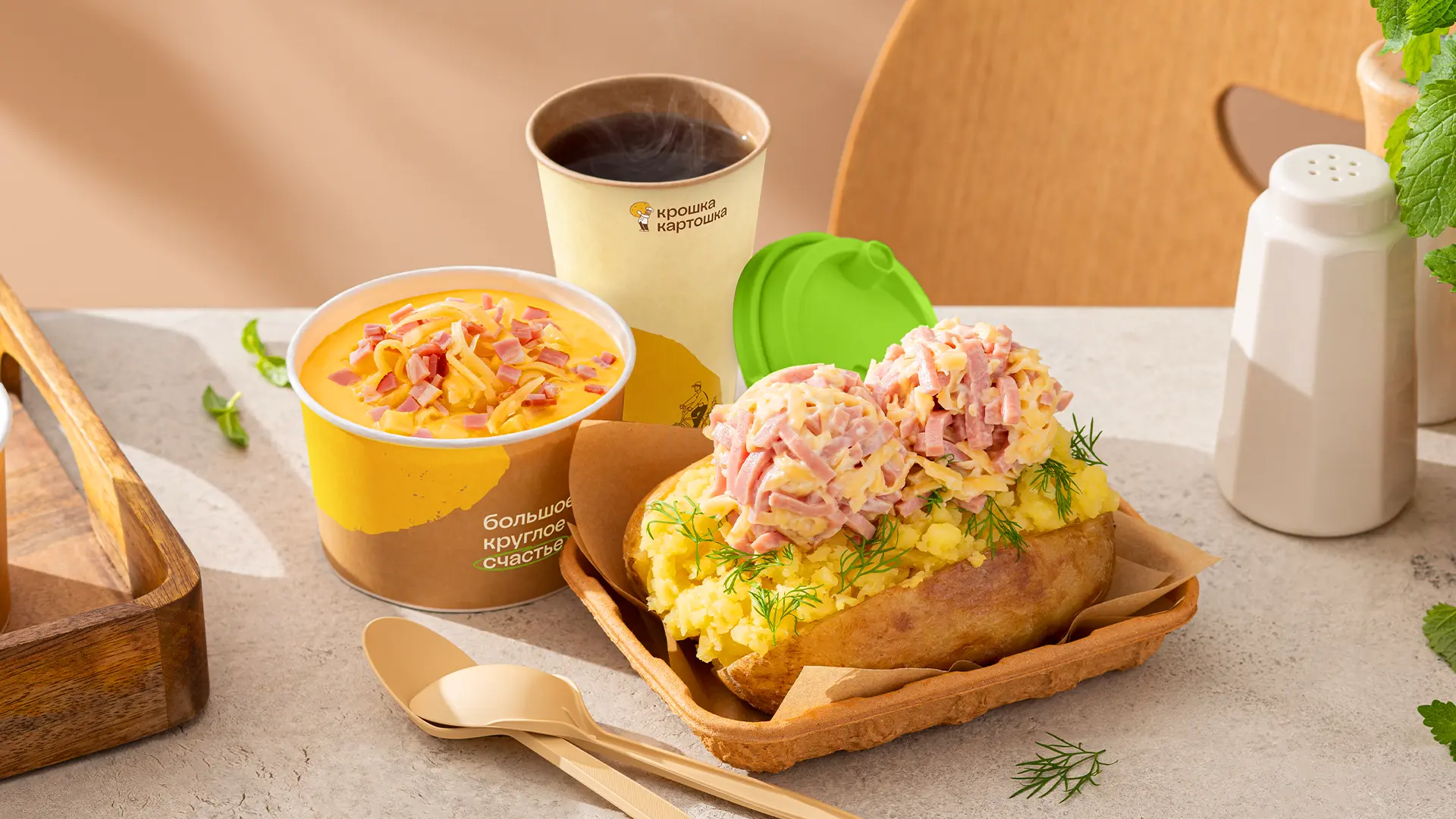
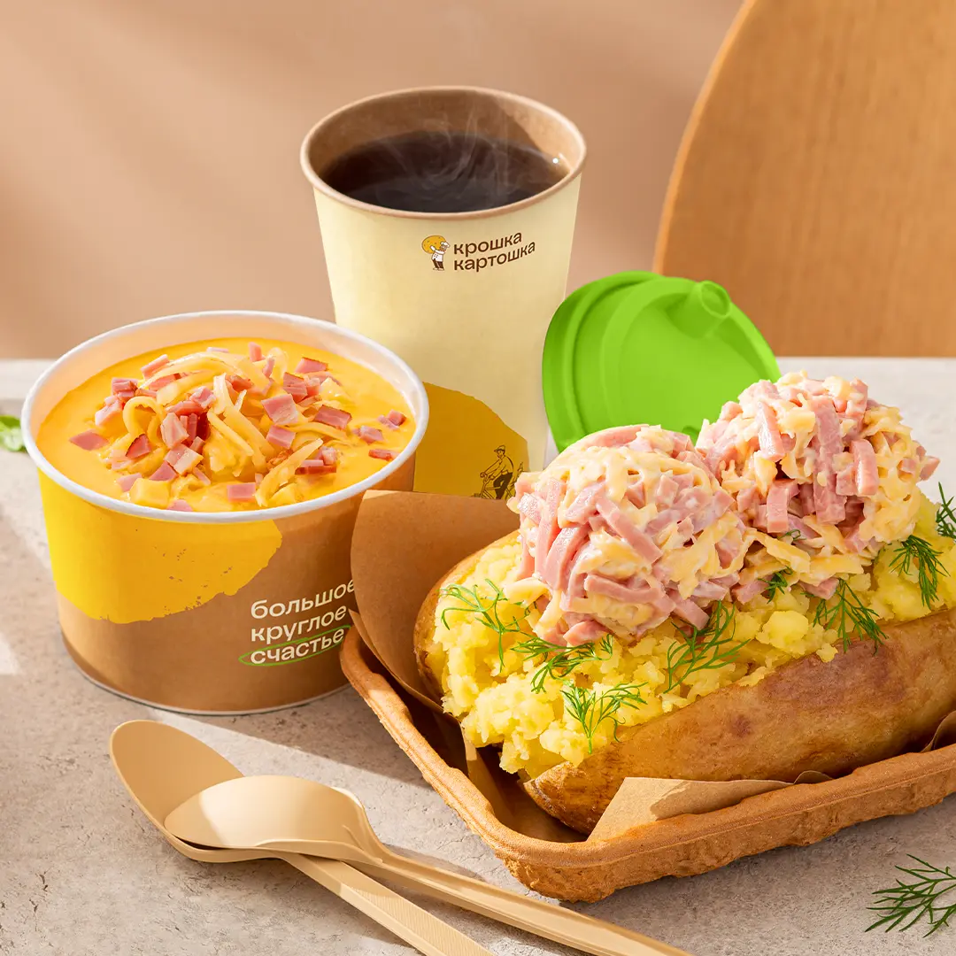
A photoshoot was conducted with a food photographer
and developed a photography style guide in the concept
of “Russian hygge“. The key is natural look: warm colors,
sunlight, imperfect but appetizing potatoes, and slight
negligence. The cozy atmosphere is complemented by dishes
and craft paper, wood, and textiles.
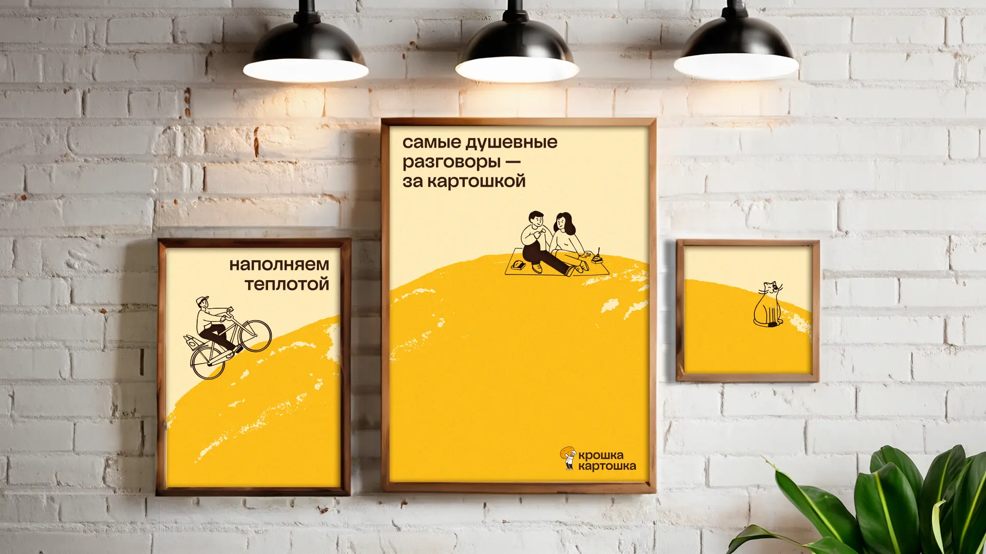
A special element of the identity is the illustrations.
To the refined chef, a companion was added — Koshka Kartoshka
(“Potato Cat“). Inspired by real cafe visitors, additional
characters were created — happy urban residents. Illustrations
are actively used in packaging, online communication, and
navigation. In the interior design, characters appear on
posters or come to life directly on the cafe walls,
becoming part of a whole microcosm.